Data Is The New Solar Energy

You’ve probably been hearing a lot about analytics and artificial intelligence in the past couple of years. Every software platform under the sun is looking to increase their visibility into the way that networks and systems behave. They can then take that data and plug it into a model and make recommendations about the way things need to be configured or designed.

Using analytics to aid troubleshooting is nothing new. We used to be able to tell when hard disks were about to go bad because of SMART reporting. Today we can use predictive analysis to determine when the disk has passed the point of no return and should be replaced well ahead of the actual failure. We can even plug that data into an AI algorithm to determine which drives on which devices need to be examined first based on a chart of performance data.

The power of this kind of data-driven network and systems operation does help our beleaguered IT departments feel as though they have a handle on things. And the power that data can offer to us has it being tracked like a precious natural resource. More than a few times I’ve heard data referred to as “the new oil”. I’d like to turn that on its head though. Data isn’t oil. It’s solar energy.

As Sure As The Sun Comes Up

Oil is created over millions of years. It’s a natural process of layering organic materials with pressure and time to create a new output. Sounds an awful lot like data, right? We create data through the interactions we have with systems. Now, let me ask you the standard Zen kōan, “If a tree falls in the forest and no one is there to hear it, does it make a sound?” More appropriate for this conversation, “If two systems exist without user interaction, do they create data?”

The fact is in today’s technology-driven world that systems are creating data whether we want them to or not. There is output no matter what happens with our interactions. That makes the data ever-present. Like our glorious stellar neighbor. The sun is going to shine no matter what we do. Our planet is going to be bathed in energy no matter if we log on to our email client today or decide to go fishing. Data is going to be generated. What we choose to do with that data determines how we can utilize it.

In order to use oil, it must be processed and refined. It also must be found, drilled out of the ground, and transported to stations where it can be converted to different products. That’s a fairly common way to look at the process of turning data into the more valuable information product we need to make decisions. But in the world of ever-present data do we really need to go looking for it? Honestly, all you need to do is look around and you’ll see it! Kind of like going outside and looking up to find the sun shining down on us.

Let’s get to the processing part. Both forms of energy must be harnessed and concentrated to be useful. Oil requires refineries. Solar power requires the use of plants to consolidate and refine the collected energy from solar panels that generate electricity or heat energy that is converted into steam-powered electricity. In both cases there is infrastructure needed to convert the rew data to information. The key is how we do it.

Our existing infrastructure is based on the petroleum economy of refinement. Our standard consumers of oil are things like cars and trucks and other oil-powered fuel consumers. But the world is changing. Electrically powered vehicles and other devices don’t need the stopgap of oil or petroleum to consume energy. They can get it directly from the electrical grid that can be fed by solar energy. As we’ve adapted our consumption models of energy, we have found better, cleaner, more efficient ways to feed it with less infrastructure. Kind of like how we’ve finally dumped clunky methods for data collection like SNMP or WMI in favor of things like telemetry and open standard models that give us more info in better fashion than traps or alerts. Even the way we handle syslog data today is leaps and bounds better than it used to be.

Lastly, the benefits to standardization on this kind of collection are legion. With solar, the sun isn’t going away for a few billion more years. It’s going to stick around and continue to cause amazing sunrises and give me sunburns for the rest of my days. We’re not going to use up the energy output of the sun even if we tried. Oil has a limited shelf life at best. If we triple the amount of oil we use for the next 30 years we are going to run out completely until more can be made over the next few million years. If we increase the amount of solar energy we use by 10x over the next hundred years we won’t even put a dent in the output of the sun that we received in a minute during that time.

Likewise, with data, moving away from the old methods of collection and reporting mean we can standardize on new systems that give us better capabilities and don’t require us to maintain old standards forever. Anyone that’s ever tried to add a new entry to an archaic old MIB database will know why we need to get more modern. And if that means cleaner data collection all around then so be it.


Tom’s Take

Generally, I despise the allusions to data being some other kind of resource. They’re designed to capture the attention of senior executives that can’t imagine anything that isn’t expensive or in a TV series like Dallas. Instead, we need to help everyone understand the merits of why these kinds of transitions and shifts matter. It’s also important to help executives understand that data needs time and effort to be effective. We can’t just pick up data and shove it into the computers to get results any more than we can shove raw crude oil into a car and expect it to run. Given today’s environmental climate though, I think we need to start relating data to newer, better forms of energy. Just sit back and enjoy the sunshine.

Friday Musings on Network Analytics

I’ve been at Networking Field Day this week, and as always the conversations have been great and focused around a variety of networking topics. One that keeps jumping out at me is network analytics. There’s a few things that have come up that were especially interesting to me:

  • Don’t ask yourself if networking monitoring is not worth your time. Odds are good you’re already monitoring stuff in your network and you don’t even realize it. Many networking vendors enable basic analytics for troubleshooting purposes. You need to figure out how to build that into a bigger part of your workflows.
  • Remember that analytics can integrate with platforms you’re already using. If you’re using ServiceNow you can integrate everything into it. No better way to learn how analytics can help you than to setup some kind of ticket generation for down networks. And, if that automation causes you to get overloaded with link flaps you’ll have even more motivation to figure out why your provider can’t keep things running.
  • Don’t discount open source tools. The world has come a long way since MRTG and Cacti. In fact, a lot of the flagship analytics platforms are built with open source tools as a starting point. If you can figure out how to use the “free” versions, you can figure out how to implement the bigger stuff too. The paid versions may look nicer or have deeper integrations, but you can bet that they all work mostly the same under the hood.
  • Finally, remember that you can’t possible deal with all this data yourself. You can collect it but parsing it is like trying to drink from a firehose of pond water. You need to treat the data and then analyze that result. Find tools (probably open source) that help you understand what you’re seeing. If it saves you 10 minutes of looking, it’s worth it.

Tom’s Take

Be sure to say tuned to our Gestalt IT On-Premise IT Roundtable podcast in the coming weeks for more great discussion on the analytics topic. We’ve got an episode that should be out soon that will take the discussion of the “expense” of networking analytics in a new direction.

Network Visibility with Barefoot Deep Insight

As you may have heard this week, Barefoot Networks is back in the news with the release of their newest product, Barefoot Deep Insight. Choosing to go down the road of naming a thing after what it actually does, Barefoot has created a solution to finding out why network packets are behaving the way they are.

Observer Problem

It’s no secret that modern network monitoring is coming out of the Dark Ages. ping, traceroute, and SNMP aren’t exactly the best tools to be giving any kind of real information about things. They were designed for a different time with much less packet flow. Even Netflow can’t keep up with modern networks running at multi-gigabit speeds. And even if it could, it’s still missing in-flight data about network paths and packet delays.

Imagine standing outside of the Holland Tunnel. You know that a car entered at a specific time. And you see the car exit. But you don’t know what happened to the car in between. If the car takes 5 minutes to traverse the tunnel you have no way of knowing if that’s normal or not. Likewise, if a car is delayed and takes 7-8 minutes to exit you can’t tell what caused the delay. Without being able to see the car at various points along the journey you are essentially guessing about the state of the transit network at any given time.

Trying to solve this problem in a network can be difficult. That’s because the OS running on the devices doesn’t generally lend itself to easy monitoring. The old days of SNMP proved that time and time again. Today’s networks are getting a bit better with regard to APIs and the like. You could even go all the way up the food chain and buy something like Cisco Tetration if you absolutely needed that much visibility.

Embedding Reporting

Barefoot solves this problem by using their P4 language in concert with the Tofino chipset to provide a way for there to be visibility into the packets as they traverse the network. P4 gives Tofino the flexibility to build on to the data plane processing of a packet. Rather than bolting the monitoring on after the fact you can now put it right along side the packet flow and collect information as it happens.

The other key is that the real work is done by the Deep Insight Analytics Software running outside of the switch. The Analytics platform takes the data collected from the Tofino switches and starts processing it. It creates baselines of traffic patterns and starts looking for anomalies in the data. This is why Deep Insight claims to be able to detect microbursts. Because the monitoring platform can analyze the data being fed to it and provide the operator with insights.

It’s important to note that this is info only. The insights gathered from Deep Insight are for informational purposes. This is where the skill of network professional comes into play. By gaining perspective into what could be causing issues like microbursts from the software you gain the ability to take your skills and fix those issues. Perhaps it’s a misconfigured ECMP pair. Maybe it’s a dead or dying cable in a link. Armed with the data from the platform, you can work your networking magic to make it right.

Barefoot says that Deep Insight builds on itself via machine learning. While machine learning is seems to be one of the buzzwords du jour it could be hoped that a platform that can analyze the states of packets can start to build an idea of what’s causing them to behave in certain ways. While not mentioned in the press release, it could also be inferred that there are ways to upload the data from your system to a larger set of servers. Then you can have more analytics applied to the datasets and more insights extracted.


Tom’s Take

The Deep Insight platform is what I was hoping to see from Barefoot after I saw them earlier this year at Networking Field Day 14. They are taking the flexibility of the Tofino chip and the extensibility of P4 and combining them to build new and exciting things that run right alongside the data plane on the switches. This means that they can provide the kinds of tools that companies are willing to pay quite a bit for and do it in a way that is 100% capable of being audited and extended by brilliant programmers. I hope that Deep Insight takes off and sees wide adoption for Barefoot customers. That will be the biggest endorsement of what they’re doing and give them a long runway to building more in the future.

It’s Probably Not The Wi-Fi

After finishing up Mobility Field Day last week, I got a chance to reflect on a lot of the information that was shared with the delegates. Much of the work in wireless now is focused on analytics. Companies like Cape Networks and Nyansa are trying to provide a holistic look at every part of the network infrastructure to help professionals figure out why their might be issues occurring for users. And over and over again, the resound cry that I heard was “It’s Not The Wi-Fi”

Building A Better Access Layer

Most of wireless is focused on the design of the physical layer. If you talk to any professional and ask them to show your their tool kit, they will likely pull out a whole array of mobile testing devices, USB network adapters, and diagramming software that would make AutoCAD jealous. All of these tools focus on the most important part of the equation for wireless professionals – the air. When the physical radio spectrum isn’t working users will complain about it. Wireless pros leap into action with their tools to figure out where the fault is. Either that, or they are very focused on providing the right design from the beginning with the tools validating that access point placement is correct and coverage overlap provides redundancy without interference.

These aren’t easy problems to solve. That’s why wireless folks get paid the big bucks to build it right or fix it after it was built wrong. Wired networkers don’t need to worry about microwave ovens or water pipes. Aside from the errant fluorescent light or overly aggressive pair of cable pliers, wired networks are generally free from the kinds of problems that can plague a wire-free access layer.

However, the better question that should be asked is how the users know it’s the wireless network that’s behind the faults? To the users, the system is in one of three states: perfect, horribly broken, or slow. I think we can all agree that the first state of perfection almost never actually exists in reality. It might exist shortly after installation when user load is low and actual application use is negligible. However, users are usually living in one of the latter states. Either the wireless is “slow” or it’s horribly broken. Why?

No-Service Station

As it turns out, thanks to some of the reporting from companies like Cape and Nyansa, it turns out that a large majority of the so-called wireless issues are in fact not wireless related at all. Those designs that wireless pros spend so much time fretting over are removed from the equation. Instead, the issues are with services.

Yes, those pesky network services. The ones like DNS or DHCP that seem invisible until they break. Or those services that we pay hefty sums to every month like Amazon or Microsoft Azure. The same issues that plague wired networking exist in the wireless world as well and seem to escape blame.

DNS is invisible to the majority of users. I’ve tried to explain it many times with middling to poor results. The idea that computers on the internet don’t understand words and must rely on services to translate them to numbers never seems to click. And when you add in the reliance on this system and how it can be knocked out with DDoS attacks or hijacking, it always comes back to being about the wireless.

It’s not hard to imagine why. The wireless is the first thing users see when they start having issues. It’s the new firewall. Or the new virus. Or the new popup. It’s a thing they can point to as the single source of problems. And if there is an issue at any point along the way, it must be the fault of the wireless. It can’t possibly be DNS or routing issues or a DDoS on AWS. Instead, the wireless is down.

And so wireless pros find themselves defending their designs and configurations without knowing that there is an issue somewhere else down the line. That’s why the analytics platforms of the future are so important. By giving wireless pros visibility into systems beyond the spectrum, they can reliably state that the wireless isn’t at fault. They can also engage other teams to find out why the DNS servers are down or why the default gateway for the branch office has been changed or is offline. That’s the kind of info that can turn a user away from blaming the wireless for all the problems and finding out what’s actually wrong.


Tom’s Take

If I had a nickel for every problem that was blamed on the wireless network or the firewall or some errant virus when that actually wasn’t the case, I could retire and buy my own evil overlord island next to Larry Ellison. Alas, these are issues that are never going to go away. Instead, the only real hope that we have is speeding the time to diagnose and resolve them by involving professionals that manage the systems that are actually down. And perhaps having some pictures of the monitoring systems goes a long way to tell users that they should make sure that the issue is indeed the wireless before proclaiming that it is. Because, to be honest, it probably isn’t the Wi-Fi.

Don’t Build Big Data With Bad Data

I was at Pure Accelerate 2017 this week and I saw some very interesting things around big data and the impact that high speed flash storage is going to have. Storage vendors serving that market are starting to include analytics capabilities on the box in an effort to provide extra value. But what happens when these advances cause issues in the training of algorithms?

Garbage In, Garbage Out

One story that came out of a conversation was about training a system to recognize people. In the process of training the system, the users imported a large number of faces in order to help the system start the process of differentiating individuals. The data set they started with? A collection of male headshots from the Screen Actors Guild. By the time the users caught the mistake, the algorithm had already proven that it had issues telling the difference between test subjects of particular ethnicities. After scrapping the data set and using some different diverse data sources, the system started performing much better.

This started me thinking about the quality of the data that we are importing into machine learning and artificial intelligence systems. The old computer adage of “garbage in, garbage out” is never more apt today than it has been in history. Before, bad inputs caused data to be suspect when extracted. Now, inputting bad data into a system designed to make decisions can have even more far-reaching consequences.

Look at all the systems that we’re programming today to be more AI-like. We’ve got self-driving cars that need massive data inputs to help navigate roads at speed. We have network monitoring systems that take analytics data and use it to predict things like component failures. We even have these systems running the background of popular apps that provide us news and other crucial information.

What if the inputs into the system cause it to become corrupted or somehow compromised? You’ve probably heard the story about how importing UrbanDictionary into Watson caused it to start cursing constantly. These kinds of stories highlight how important the quality of data being used for the basis of AI/ML systems can be.

Think of a future when self-driving cars are being programmed with failsafes to avoid living things in the roadway. Suppose that the car has been programmed to avoid humans and other large animals like horses and cows. But, during the import of the small animal data set, the table for dogs isn’t imported for some reason. Now, what would happen if the car encountered a dog in the road? Would it make the right decision to avoid the animal? Would the outline of the dog trigger a subroutine that helped it make the right decision? Or would the car not be able to tell what a dog was and do something horrible?

Do You See What I See?

After some chatting with my friend Ryan Adzima, he taught me a bit about how facial recognition systems work. I had always assumed that these systems could differentiate on things like colors. So it could tell a blond woman from a brunette, for instance. But Ryan told me that it’s actually very difficult for a system to tell fine colors apart.

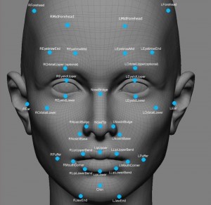
Instead, systems try to create contrast in the colors of the picture so that certain features stand out. Those features have a grid overlaid on them and then those grids are compared and contrasted. That’s the fastest way for a system to discern between individuals. It makes sense considering how CPU-bound things are today and the lack of high definition cameras to capture information for the system.

But, we also must realize that we have to improve data collection for our AI/ML systems in order to ensure that the systems are receiving good data to make decisions. We need to build validation models into our systems and checks to make sure the data looks and sounds sane at the point of input. These are the kinds of things that take time and careful consideration when planning to ensure they don’t become a hinderance to the system. If the very safeguards we put in place to keep data correct end up causing problems, we’re going to create a system that falls apart before it can do what it was designed to do.


Tom’s Take

I thought the story about the AI training was a bit humorous, but it does belie a huge issue with computer systems going forward. We need to be absolutely sure of the veracity of our data as we begin using it to train systems to think for themselves. Sure, teaching a Jeopardy-winning system to curse is one thing. But if we teach a system to be racist or murderous because of what information we give it to make decisions, we will have programmed a new life form to exhibit the worst of us instead of the best.

Networking Needs Information, Not Data

GameAfoot

Networking Field Day 12 starts today. There are a lot of great presenters lined up. As I talk to more and more networking companies, it’s becoming obvious that simply moving packets is not the way to go now. Instead, the real sizzle is in telling you all about those packets instead. Not packet inspection but analytics.

Tell Me More, Tell Me More

Ask any networking professional and they’ll tell you that the systems they manage have a wealth of information. SNMP can give you monitoring data for a set of points defined in database files. Other protocols like NetFlow or sFlow can give you more granular data about a particular packet group of data flow in your network. Even more advanced projects like Intel’s Snap are building on the idea of using telemetry to collect disparate data sources and build collection methodologies to do something with them.

The concern that becomes quickly apparent is the overwhelming amount of data being received from all these sources. It reminds me a bit of this scene:

How can you drink from this firehose? Maybe you should be asking if you should instead?

Order From Chaos

Data is useless. We need to perform analysis on it to get information. That’s where a new wave of companies is coming into the networking market. They are building on the frameworks and systems that are aggregating data and presenting it in a way that makes it useful information. Instead of random data points about NetFlow, these solutions tell you that you’ve got a huge problem with outbound traffic of a specific type that is sent at a specific time with a specific payload. The difference is that instead of sorting through data to make sense of it, you’ve got a tool delivering the analysis instead of the raw data.

Sometimes it’s as simple as color-coding lines of Wireshark captures. Resets are bad, so they show up red. Properly torn down connections are good so they are green. You can instantly figure out how good things are going by looking for the colors. That’s analysis from raw data. The real trick in modern networking monitoring is to find a way to analyze and provide context for massive amounts of data that may not have an immediate correlation.

Networking professionals are smart people. They can intuit a lot of potential issues from a given data set. They can make the logical leap to a specific issue given time. What reduces that ability is the sheer amount of things that can go wrong with a particular system and the speed at which those problems must be fixed, especially at scale. A hiccup on one end of the network can be catastrophic on the others if allowed to persist.

Analytics can give us the context we need. It can provide confidence levels for common problems. It can ensure that symptoms are indeed happening above a given baseline or threshold. It can help us narrow the symptoms and potential issues before we even look at the data. Analytics can exclude the impossible while highlighting the more probably causes and outcomes. Analytics can give us peace of mind.


Tom’s Take

Analytics isn’t doing our job for us. Instead, it’s giving us the ability to concentrate. Anyone that spends their time sifting through data to try and find patterns is losing the signal in the noise. Patterns are things that software can find easily. We need to leverage the work being put into network analytics systems to help us track down the issues before they blow up into full problems. We need to apply the thing that makes network professionals the best suited to look at the best information we can gather about a situation. Our concentration on what matters is where our job will be in five years. Let’s take the knowledge we have and apply it.

Gathering No MOS

mossBall1

If you work in the voice or video world, you’ve undoubtedly heard about Mean Opinion Scores (MOS). MOS is a rough way of ranking the quality of the sound on a call. It’s widely used to determine the over experience for the user on the other end of the phone. MOS represents something important in the grand scheme of communications. However, MOS is quickly becoming a crutch that needs some explanation.

That’s Just Like Your Opinion

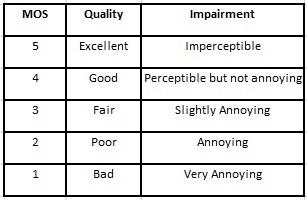
The first think to keep in mind when you look at MOS data is that the second word in the term is opinion. Originally, MOS was derived by having selected people listen to calls and rank them on a scale of 1 (I can’t hear you) to 5 (We’re sitting next to each other). The idea was to see if listeners could distinguish when certain aspects of the call were changed, such as pathing or exchange equipment. It was an all-or-nothing ranking. Good calls got a 4 or even rarely a 5. Most terrible calls got 2 or 3. You take the average of all your subjects and that gives your the overall MOS for your system.

voip-qualitypbx

When digital systems came along, MOS took on an entirely different meaning. Rather than being used to subjectively rank call quality, MOS became a yardstick for tweaking the codec used to digitally transform analog speech to digital packets. Since this has to happen in order for the data to be sent, all digital calls must have a codec somewhere. The first codecs were trying to approximate the quality of a long distance phone call, which was the gold standard for quality. After that target was reached, providers started messing around the codecs in question to reduce bandwidth usage.

G.711 is considered the baseline level of call quality from which all others are measure. It has a relative MOS of 4.1, which means very good voice quality. It also uses around 64 kbps of bandwidth. As developers started playing with encoding schemes and other factors, they started developing codecs which used significantly less bandwidth and had almost equivalent quality. G.729 uses only 8 kbps of bandwidth but has a MOS of 3.9. It’s almost as good as G.711 in most cases but uses an eighth of the resources.

MOS has always been subjective. That was until VoIP system providers found that certain network metrics have an impact on the quality of a call. Things like packet loss, delay, and jitter all have negative impacts on call quality. By measuring these values a system could give an approximation of MOS for an admin without needing to go through the hassle of making people actually listen to the calls. That data could then be provided through analytics dashboards as an input into the overall health of the system.

Like A Rolling Stone

The problem with MOS is that it has always been subjective. Two identical calls may have different MOS scores based on the listener. Two radically different codecs could have similar MOS scores because of simple factors like tonality or speech isolation. Using a subjective ranking matrix to display empirical data is unwieldy at best. The only reason to use MOS as a yardstick is because everyone understands what MOS is.

Enter R-values. R-values take inputs from the same monitoring systems that produce MOS and rank those inputs on a scale of 1 – 100. Those scores can then be ranked with more precision to determine call quality and VoIP network health. A call in the 90s is a great call. If things dip in the 70s or the 60s, there are major issues to identify. R-values solve the problem of trying to bolt empirical data onto a subjective system.

Now that communications is becoming more and more focused on things like video, the need for analytics around them is becoming more pronounced. People want to track the same kinds of metrics – codec quality, packet loss, delay, and jitter. But there isn’t a unified score that can be presented in green, yellow, and red to let people know when things are hitting the fan.

It has been suggested that MOS be adapted to reference video in addition to audio. While the idea behind using a traditional yardstick like MOS sounds good on the surface, the reality is that video is a much more complicated thing that can’t be encompassed by a 50-year-old ranking method like MOS.

Video calls can look horrible and sound great. They can have horrible sound and be crystal clear from a picture perspective. There are many, many subjective pieces that can go into ranking a video call. Trying to shoehorn that into a simple scale of 5 values is doing a real disservice to video codec manufacturers, not to mention the network operators that try and keep things running smoothly for video users.

R-value seems to be a much better way to classify analytics for video. It’s much more nuanced and capable of offering insight into different aspects of call and picture quality. It can still provide a ranked score for threshold measuring, but that rank is much more likely to mean something important for each number as opposed to the absolute values present in MOS.


Tom’s Take

MOS is an old fashioned idea that tries valiantly to tie the telecom of old to the digital age. People who understood subjective quality tried to pair it with objective analytics in an effort to keep the old world and the new world matched. But even communications is starting to eclipse these bounds. Phone calls have given way to email, texting, and video chats. Two of those are asynchronous and require no network reliability beyond up or down. Video, and all the other real-time digital communications, needs to have the right metrics and analytics to provide good feedback about how to improve the experience for users. And whatever we end up calling that composite metric or ranked algorithmic score, it shouldn’t be called MOS. Time to let that term grow some moss in the retirement bin.


Replacing Nielsen With Big Data

Embed from Getty Images

I’m a fan of television. I like watching interesting programs. It’s been a few years since one has caught my attention long enough to keep my watching for multiple seasons. Part of that reason is due to my fear that an awesome program is going to fail to reach a “target market” and will end up canceled just when it’s getting good. It’s happened to several programs that I liked in the past.

Sampling the Goods

Part of the issue with tracking the popularity of television programs comes from the archaic method in which programs are measured. Almost everyone has heard of the Nielsen ratings system. This sampling method was created in the 1930s as a way to measure radio advertising reach. In the 50s, it was adapted for use in television.

Nielsen selects target audiences that represent the greater whole. They ask users to keep written diaries of their television watching habits. They also have the ability to install a device called a set meter which allows viewers to punch in a code to identify themselves via age groups and lock in a view for a program. The set meter can tell the instant a channel is changed or the TV is powered off.

In theory, the sampling methodology is sound. In practice, it’s a bit shaky. View diaries are unreliable because people tend to overreport their view habits. If they feel guilty that they haven’t been writing anything down, they tend to look up something that was on TV and write it down. Diaries also can’t determine if a viewer watched the entire program or changed the channel in the middle. Set meters aren’t much better. The reliance on PIN codes to identify users can lead to misreported results. Adults in a hurry will sometimes punch in an easier code assigned to their children, leading to skewed age results.

Both the diary and the set meter fail to take into account the shift in viewing habits in modern households. Most of the TV viewing in my house takes place through time-shifted DVR recordings. My kids tend to monopolize the TV during the day, but even they are moving to using services like Netflix to watch all episodes of their favorite cartoons in one sitting. Neither of these viewing habits are easily tracked by Nielsen.

How can we find a happy medium? Sample sizes have been reduced signifcantly due to cord-cutting households moving to Internet distribution models. People tend to exaggerate or manipulate self-reported viewing results. Even “modern” Nielsen technology can’t keep up. What’s the answer?

Big Data

I know what you’re saying: “We’ve already got that with Nielsen, right?” Not quite. TV viewing habits have shifted in the past few years. So has TV technology. Thanks to the shift from analog broadcast signals to digital and the explosion of set top boxes for cable decryption and movie service usage, we now have a huge portal into the living room of every TV watcher in the world.

Think about for a moment. The idea of a sample size works provided it’s a good representative sample. But tracking this data is problematic. If we have access to a way to crunch the actual data instead of extrapolating from incomplete sets shouldn’t we use that instead? I’d rather believe the real numbers instead of trying to guess from unreliable sources.

This also fixes the issue of time-shifted viewing. Those same set top boxes are often responsible for recording the programs. They could provide information such as number of shows recorded versus viewed and whether or not viewers skip through commercials. For those that view on mobile devices that data could be compiled as well through integration with the set top box. User logins are required for mobile apps as it is today. It’s just a small step to integrating the whole package.

It would require a bit of technical upgrading on the client side. We would have to enable the set top boxes to report data back to a service. We could anonymize the data to a point to be sure that people aren’t being unnecessarily exposed. It will also have to be configured as an opt-out setting to ensure that the majority is represented. Opt-in won’t work because those checkboxes never get checked.

Advertisers are going to demand the most specific information about people that they can. The ratings service exists to work for the advertisers. If this plan is going to work, a new company will have to be created to collect and analyze this data. This way the analysis company can ensure that the data is specific enough to be of use to the advertisers while at the same time ensuring the protection of the viewers.


Tom’s Take

Every year, promising new TV shows are yanked off the airwaves because advertisers don’t see any revenue. Shows that have a great premise can’t get up to steam because of ratings. We need to fix this system. In the old days, the deluge of data would have drown Nielsen. Today, we have the technology to collect, analyze, and store that data for eternity. We can finally get the real statistics on how many people watched Jericho or After MASH. Armed with real numbers, we can make intelligent decisions about what to keep on TV and what to jettison. And that’s a big data project I’d be willing to watch.